

Learn through the super-clean Baeldung Pro experience:
>> Membership and Baeldung Pro.
No ads, dark-mode and 6 months free of IntelliJ Idea Ultimate to start with.
Learn through the super-clean Baeldung Pro experience:
>> Membership and Baeldung Pro.
No ads, dark-mode and 6 months free of IntelliJ Idea Ultimate to start with.
In this tutorial, we’ll show how to use the proportion of variance to set the number of principal components in Principal Component Analysis (PCA) and its main theoretical aspects. Moreover, we’ll present a numerical example aiming to highlight its importance.
A key challenge we face in Principal Component Analysis (PCA) is to define the number of principal components (PCs). If we select a large number of PCs, we lose the benefit of dimensionality reduction. Or even worse, we increase computational complexity and encounter difficulties visualizing high-dimensional spaces. On the other hand, with a small number of PCs, we might miss an important aspect of the data. Therefore, this can lead us to wrong conclusions in subsequent analyses.
To avoid this problem, we can compute the proportion of our data’s variance. This shows the dispersion, or how spread the data points are around the mean. But why is this important when it comes to PCA? The principal components that PCA computes are ordered by the variance they explain. Additionally, these components are uncorrelated and, therefore, orthogonal to each other. This ensures that each component captures variance in the data that no other component captures. So, if we have the proportion of variance for each component, we can choose the first few components with the greatest cumulative proportion of explained variance.
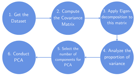
Here is the general workflow of how things work:
As an illustration, let’s consider an example with three variables. In this case, each column of the matrix X corresponds to a variable, and each row corresponds to a data point:
![\[X = \begin{bmatrix} -0.1347 & 1.5087 & -1.1303 \\ 2.6743 & 1.2540 & -0.0716 \\ 0.0737 & 0.6956 & 0.2773 \\ 0.8986 & 0.6414 & -1.5479 \end{bmatrix}\]](/wp-content/ql-cache/quicklatex.com-b9284874e4a527c66a765e45f225dde9_l3.svg "Rendered by QuickLaTeX.com")
The corresponding covariance matrix for this data is:
![\[\Sigma = \begin{bmatrix} \boldsymbol{2.4160} & 0.2892 & 0.81074 \\ 0.2892 & \boldsymbol{0.1807} & -0.0203 \\ 0.8107 & -0.0203 & \boldsymbol{0.7425} \end{bmatrix}\]](/wp-content/ql-cache/quicklatex.com-a97aab7a85ee9a9ab7d803778e94a737_l3.svg "Rendered by QuickLaTeX.com")
We can find the variances in the diagonal of the covariance matrix. Their sum is equal to 3.3392, which represents the overall variability, while the off-diagonal elements represent the covariances between the three variables.
Next, we perform a PCA on our data X with three components (n=3) and get 2.7706, 0.4657, and 0.1028 as the explained variances. Notably, these are the eigenvalues of the covariance matrix.
But how can we interpret these results? Since the first eigenvalue is 2.7706, the first PC explains 2.7706/3.3392 = 82.97% of the overall variability for the dataset. So, this principal component captures a lot of the information in the data. The second component accounts for 0.4657/3.3392 = 13.94% of the variability, and the last principal component explains 0.1028/3.3392 =3.08% of the variance. :
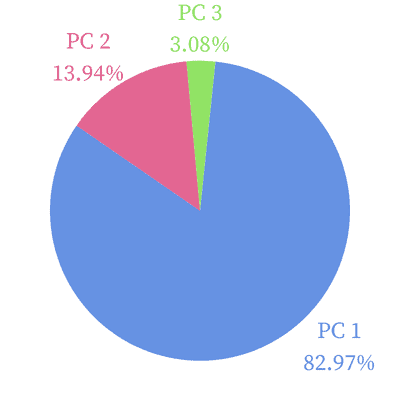
This means that if we drop the third PC, we’ll still explain 82.97% + 13.94% = 96.91% of the dataset’s overall variability. So, the first two components are sufficient to explain our data.
There’s no universal threshold of cumulative proportion after which we can stop increasing the number of PCs. However, there are some guidelines and rules of thumb.
First, the threshold depends on the objective of our analysis and the constraints involved. If we aim to draw critical conclusions to provide secure and meaningful insights, we should aim at a proportion of around 95%. In general applications, a good value ranges from 80% to 95%. But again, this is arbitrary and should be evident when reporting and presenting any analysis. In some critical applications, the threshold can be even higher.
However, for highly correlated variables, having a low variance proportion isn’t a problem. In that case, there is a lot of redundancy across the variables. For that reason, a small proportion of explained variance is usually enough to represent the variability of the dataset. Additionally, we may have constraints in our model, which means we simply can’t have as many PCs as we want. This might also lead us to accept a lower proportion of variance.
Another tool that we can use is a scree plot. In this graph, we see the cumulative explained variance for each principal component and the individual-explained variances. Here is an example:
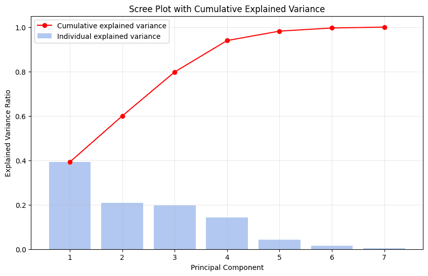
These are the cumulative explained variances for the seven components: 0.39, 0.59, 0.79, 0.93, 0.98, 0.99, 1. This means that the first PC alone accounts for 39% of the total variability. We can easily see that with four PCs, we represent 93% of the variability of the data. At this point, there’s an abrupt change in the slope of the curve in red, characterizing an “elbow”. This is the point at which we can stop adding more PCAs since they don’t contribute significantly to the total variance explained. The addition of the last three PCs would increase the explained variance by only 7%.
In this article, we discussed and illustrated the proportion of variance in the context of PCA. This indicator shows us how much variability of the dataset the principal components explain.
We use the proportion to choose the components that, together, explain most of the variance. This rule of thumb implicitly determines the number of PCs in PCA and reduces the dimensionality of the dataset while maintaining fidelity to the original data.