Mocking is an essential part of unit testing, and the Mockito library makes it easy to write clean and intuitive unit tests for your Java code.
Get started with mocking and improve your application tests using our Mockito guide:
Handling concurrency in an application can be a tricky process with many potential pitfalls. A solid grasp of the fundamentals will go a long way to help minimize these issues.
Get started with understanding multi-threaded applications with our Java Concurrency guide:
Spring 5 added support for reactive programming with the Spring WebFlux module, which has been improved upon ever since. Get started with the Reactor project basics and reactive programming in Spring Boot:
Since its introduction in Java 8, the Stream API has become a staple of Java development. The basic operations like iterating, filtering, mapping sequences of elements are deceptively simple to use.
But these can also be overused and fall into some common pitfalls.
To get a better understanding on how Streams work and how to combine them with other language features, check out our guide to Java Streams:
Explore Spring Boot 3 and Spring 6 in-depth through building a full REST API with the framework:
Yes, Spring Security can be complex, from the more advanced functionality within the Core to the deep OAuth support in the framework.
I built the security material as two full courses - Core and OAuth, to get practical with these more complex scenarios. We explore when and how to use each feature and code through it on the backing project.
You can explore the course here:
Spring Data JPA is a great way to handle the complexity of JPA with the powerful simplicity of Spring Boot.
Get started with Spring Data JPA through the guided reference course:
Refactor Java code safely — and automatically — with OpenRewrite.
Refactoring big codebases by hand is slow, risky, and easy to put off. That’s where OpenRewrite comes in. The open-source framework for large-scale, automated code transformations helps teams modernize safely and consistently.
Each month, the creators and maintainers of OpenRewrite at Moderne run live, hands-on training sessions — one for newcomers and one for experienced users. You’ll see how recipes work, how to apply them across projects, and how to modernize code with confidence.
Join the next session, bring your questions, and learn how to automate the kind of work that usually eats your sprint time.
Yes, we're now running our only Summer Sale. All Courses are 30% off until 20th July, 2026:
Yes, we're now running our only Summer Sale. All Courses are 30% off until 20th July, 2026:
1. Introduction
Primefaces is an open source UI component suite for Java Server Faces (JSF) applications.
In this tutorial, we’ll give an introduction to Primefaces, and demonstrate how to configure it and use some of its main features.
2. Overview
2.1. Java Server Faces
Java Server Faces is a component-oriented framework for building user interfaces for Java web applications. The JSF specification is formalized through the Java Community Process and is a standardized display technology.
More about JSF in Spring environment can be found here.
2.2. Primefaces
Built on top of JSF, Primefaces supports rapid application development by providing pre-built UI components which can be added to any project.
In addition to Primefaces, there is also the Primefaces Extensions project. This community-based, open-source project provides additional components besides the standard ones.
3. Application Setup
For the purpose of demonstrating some Primefaces components, let’s create a simple web application using Maven.
3.1. Maven Configuration
Primefaces has a lightweight configuration with only one jar so to get started, let’s add the dependency to our pom.xml:
<dependency>
    <groupId>org.primefaces</groupId>
    <artifactId>primefaces</artifactId>
    <version>6.2</version>
</dependency>
The latest version can be found here.
3.2. Controller – Named Bean
Next, let’s create the bean class for our component:
@Named("helloPFBean")
public class HelloPFBean {
}
We need to provide a @Named annotation to bind our controller to a view component.
3.3. View
Finally, let’s declare the Primefaces namespace in our .xhtml file:
<html xmlns:p="http://primefaces.org/ui">
4. Example Components
To render the page, start the server and navigate to:
http://localhost:8080/jsf/pf_intro.xhtml4.1. PanelGrid
Let’s use PanelGrid as an extension to standard JSF panelGrid:
<p:panelGrid columns="2">
    <h:outputText value="#{helloPFBean.firstName}"/>
    <h:outputText value="#{helloPFBean.lastName}" />
</p:panelGrid>
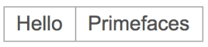
Here, we’ve defined a panelGrid with two columns and set the outputText from JSF facelets to display data from a named bean.
The values declared in each outputText correspond to firstName and lastName properties declared in our @Named:
private String firstName;
private String lastName;
Let’s take a look at our first, simple component:
4.2. SelectOneRadio
We can use selectOneRadio component to provide a radio button functionality:
<h:panelGrid columns="2">
    <p:outputLabel for="jsfCompSuite" value="Component Suite" />
    <p:selectOneRadio id="jsfCompSuite" value="#{helloPFBean.componentSuite}">
        <f:selectItem itemLabel="ICEfaces" itemValue="ICEfaces" />
        <f:selectItem itemLabel="RichFaces" itemValue="Richfaces" />
    </p:selectOneRadio>
</h:panelGrid>
We need to declare the value variable in the backing bean to hold the radio button value:
private String componentSuite;
This setup will result in a 2 option radio button which is tied to the underlying String property componentSuite:
4.3. Data Table
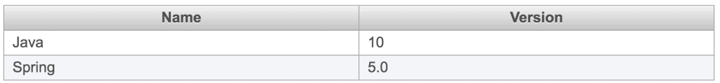
Next, let’s use the dataTable component to display data in a table layout:
<p:dataTable var="technology" value="#{helloPFBean.technologies}">
    <p:column headerText="Name">
        <h:outputText value="#{technology.name}" />
    </p:column>

    <p:column headerText="Version">
        <h:outputText value="#{technology.currentVersion}" />
    </p:column>
</p:dataTable>
Similarly, we need to provide a Bean property to hold the data for our table:
private List<Technology> technologies;
Here, we have a list of various technologies and their version numbers:
4.4. Ajax With InputText
We can also use p:ajax to provide Ajax features to our components.
For example, let’s use this component to apply a blur event:
<h:panelGrid columns="3">
    <h:outputText value="Blur event " />
    <p:inputText id="inputTextId" value="#{helloPFBean.inputText}}">
        <p:ajax event="blur" update="outputTextId"
	  listener="#{helloPFBean.onBlurEvent}" />
    </p:inputText>
    <h:outputText id="outputTextId"
      value="#{helloPFBean.outputText}" />
</h:panelGrid>
Accordingly, we’ll need to provide properties in the bean:
private String inputText;
private String outputText;
In addition, we also need to provide a listener method in our bean for our AJAX blur event:
public void onBlurEvent() {
    outputText = inputText.toUpperCase();
}
Here, we’ve simply converted the text to upper case to demonstrate the mechanism:
4.5. Button
Besides that, we can also use p:commandButton as an extension to the standard h:commandButton component.
For example:
<p:commandButton value="Open Dialog"
  icon="ui-icon-note"
  onclick="PF('exDialog').show();">
</p:commandButton>
As a result, with this configuration, we have the button which we’ll use to open dialog (using onclick attribute):

4.6. Dialog
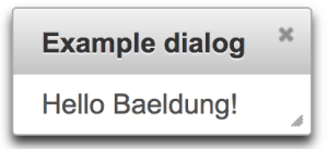
Furthermore, to provide the functionality of the dialog, we can use p:dialog component.
Let’s also use the button from the last example to open dialog on click:
<p:dialog header="Example dialog" widgetVar="exDialog" minHeight="40">
    <h:outputText value="Hello Baeldung!" />
</p:dialog>
In this case, we have a dialog with the basic configuration which can be triggered using the commandButton described in the previous section:
5. Primefaces Mobile
Primefaces Mobile (PFM) provides a UI kit to create Primefaces applications for mobile devices.
For this reason, PFM supports responsive design adjusted for mobile devices.
5.1. Configuration
To begin with, we need to enable mobile navigation support inside our faces-config.xml:
<navigation-handler>
    org.primefaces.mobile.application.MobileNavigationHandler
</navigation-handler>
5.2. Namespace
Then, to use PFM components, we need to include the PFM namespace in our .xhtml file:
xmlns:pm="http://primefaces.org/mobile"Besides the standard Primefaces jar, there is no need for any additional library in our configuration.
5.3. RenderKit
Last, we need to provide RenderKit, which is used to render the components in the mobile environment.
In case of a single PFM page within an application, we can define a RenderKit inside our page:
<f:view renderKitId="PRIMEFACES_MOBILE" />With a full PFM application, we can define our RenderKit at the application scope inside faces-config.xml:
<default-render-kit-id>PRIMEFACES_MOBILE</default-render-kit-id>
5.4. Example Page
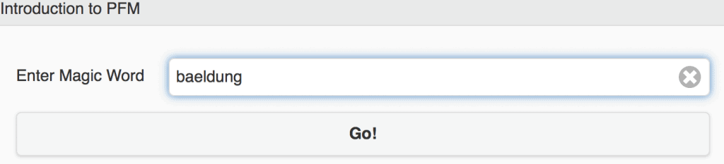
Now, let’s make example PFM page:
<pm:page id="enter">
    <pm:header>
        <p:outputLabel value="Introduction to PFM"></p:outputLabel>
    </pm:header>
    <pm:content>
        <h:form id="enterForm">
            <pm:field>
	        <p:outputLabel
                  value="Enter Magic Word">
                </p:outputLabel>
	        <p:inputText id="magicWord"
                  value="#{helloPFMBean.magicWord}">
                </p:inputText>
	    </pm:field>
            <p:commandButton
              value="Go!" action="#{helloPFMBean.go}">
            </p:commandButton>
	</h:form>
     </pm:content>
</pm:page>
As can be seen, we used page, header and content component from PFM to build a simple form with a header:
Furthermore, we used our backing bean for user input check and navigation:
public String go() {
    if(this.magicWord != null
      && this.magicWord.toUpperCase().equals("BAELDUNG")) {
	return "pm:success";
     }

    return "pm:failure";
}
In case of a correct word, we navigate to next page:
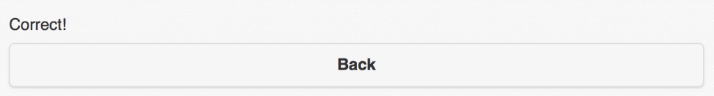
<pm:page id="success">
    <pm:content>
        <p:outputLabel value="Correct!">
        </p:outputLabel>
	<p:button value="Back"
          outcome="pm:enter?transition=flow">
        </p:button>
    </pm:content>
</pm:page>
This configuration results in this layout:
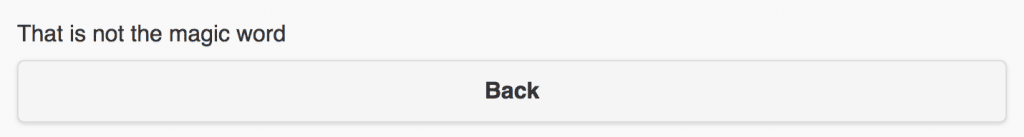
In case of an incorrect word, we navigate to next page:
<pm:page id="failure">
    <pm:content>
        <p:outputLabel value="That is not the magic word">
        </p:outputLabel>
	<p:button value="Back" outcome="pm:enter?transition=flow">
        </p:button>
    </pm:content>
</pm:page>
This configuration will result in this layout:
Note that PFM is deprecated in version 6.2 and will be removed in version 6.3 in favor of a responsive standard kit.
6. Conclusion
In this tutorial, we’ve explained the benefits of using the Primefaces JSF component suite and demonstrated how to configure and use Primefaces in a Maven-based project.
In addition, we introduced Primefaces Mobile, UI kit specialized for mobile devices.