
Mocking is an essential part of unit testing, and the Mockito library makes it easy to write clean and intuitive unit tests for your Java code.
Get started with mocking and improve your application tests using our Mockito guide:
Handling concurrency in an application can be a tricky process with many potential pitfalls. A solid grasp of the fundamentals will go a long way to help minimize these issues.
Get started with understanding multi-threaded applications with our Java Concurrency guide:
Spring 5 added support for reactive programming with the Spring WebFlux module, which has been improved upon ever since. Get started with the Reactor project basics and reactive programming in Spring Boot:
Since its introduction in Java 8, the Stream API has become a staple of Java development. The basic operations like iterating, filtering, mapping sequences of elements are deceptively simple to use.
But these can also be overused and fall into some common pitfalls.
To get a better understanding on how Streams work and how to combine them with other language features, check out our guide to Java Streams:
Explore Spring Boot 3 and Spring 6 in-depth through building a full REST API with the framework:
Yes, Spring Security can be complex, from the more advanced functionality within the Core to the deep OAuth support in the framework.
I built the security material as two full courses - Core and OAuth, to get practical with these more complex scenarios. We explore when and how to use each feature and code through it on the backing project.
You can explore the course here:
Spring Data JPA is a great way to handle the complexity of JPA with the powerful simplicity of Spring Boot.
Get started with Spring Data JPA through the guided reference course:
Refactor Java code safely — and automatically — with OpenRewrite.
Refactoring big codebases by hand is slow, risky, and easy to put off. That’s where OpenRewrite comes in. The open-source framework for large-scale, automated code transformations helps teams modernize safely and consistently.
Each month, the creators and maintainers of OpenRewrite at Moderne run live, hands-on training sessions — one for newcomers and one for experienced users. You’ll see how recipes work, how to apply them across projects, and how to modernize code with confidence.
Join the next session, bring your questions, and learn how to automate the kind of work that usually eats your sprint time.
1. Overview
In this tutorial, we’ll see how to use JFreeChart, a comprehensive Java library for creating a wide variety of charts. We can use it to integrate graphical data representations into a Swing application. It also includes a separate extension for JavaFX.
We’ll start with the basics, covering setup and chart creation, and try a few different types of charts.
2. Creating Our First Chart
JFreeChart allows us to create line charts, bar charts, pie charts, scatter plots, time series charts, histograms, and others. It can also combine different charts into a single view.
2.1. Setting Up Dependencies
To get started, we need to add the jfreechart artifact to our pom.xml file:
<dependency>
    <groupId>org.jfree</groupId>
    <artifactId>jfreechart</artifactId>
    <version>1.5.4</version>
</dependency>
We should always check the latest release and its JDK compatibility to make sure our project is up-to-date and working properly. In this case, version 1.5.4 requires JDK8 or later.
2.2. Creating a Basic Line Chart
Let’s start by using DefaultCategoryDataset to create a dataset for our graph:
DefaultCategoryDataset dataset = new DefaultCategoryDataset();
dataset.addValue(200, "Sales", "January");
dataset.addValue(150, "Sales", "February");
dataset.addValue(180, "Sales", "March");
dataset.addValue(260, "Sales", "April");
dataset.addValue(300, "Sales", "May");
Now, we can create a JFreeChart object that uses the previous dataset to plot a line chart.
The ChartFactory.createLineChart method takes the chart title, the x-axis and y-axis labels, and the dataset as parameters:
JFreeChart chart = ChartFactory.createLineChart(
    "Monthly Sales",
    "Month",
    "Sales",
    dataset);
Next, a ChartPanel object is essential for displaying our chart within a Swing component. This object is then used as a JFrame content pane to create the application window:
ChartPanel chartPanel = new ChartPanel(chart);
JFrame frame = new JFrame();
frame.setSize(800, 600);
frame.setContentPane(chartPanel);
frame.setLocationRelativeTo(null);
frame.setDefaultCloseOperation(JFrame.EXIT_ON_CLOSE);
frame.setVisible(true);
When we run this code, we’ll see our Monthly Sales graph:
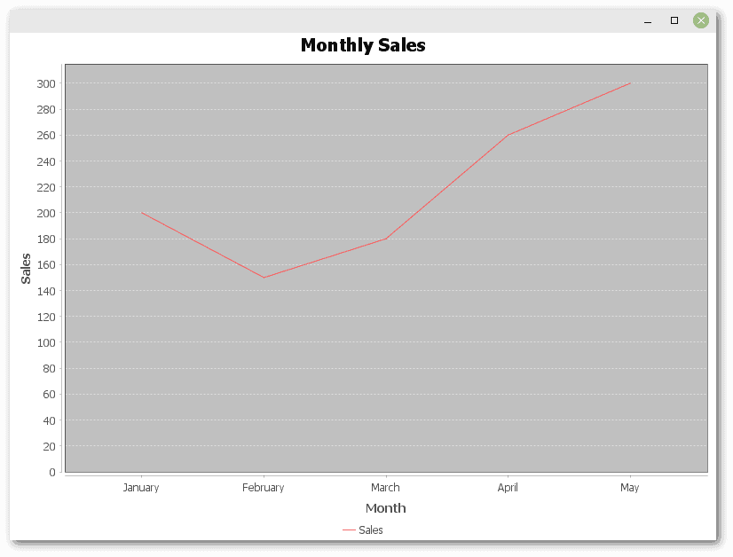
As we can see, we’ve created a chart using only a small amount of code.
3. Exploring Different Types of Charts
In the remaining examples, we’ll try some different types of charts. We won’t need to change the code much.
3.1. Bar Charts
We can modify the JFreeChart creation code to convert our line graph to a bar chart:
JFreeChart chart = ChartFactory.createBarChart(
    "Monthly Sales",
    "Month",
    "Sales",
    dataset);
This plots the dataset from the previous example:
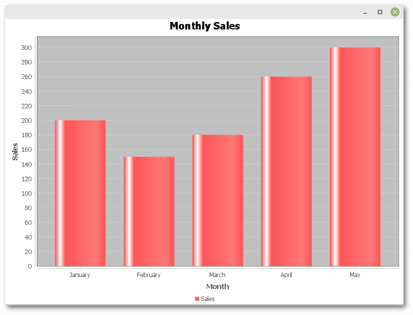
As we can see, JFreeChart is quite flexible, making it easy to display the same data with different kinds of charts.
3.2. Pie Charts
Pie charts show the proportion of parts within a whole. To create a pie chart, we need to use the DefaultPieDataset class to create our dataset. We also use the createPieChart() method to build our JFreeChart object:
DefaultPieDataset<String> dataset = new DefaultPieDataset<>();
dataset.setValue("January", 200);
dataset.setValue("February", 150);
dataset.setValue("March", 180);

JFreeChart chart = ChartFactory.createPieChart(
    "Monthly Sales",
    dataset,
    true,    // include legend
    true,    // generate tooltips
    false);  // no URLs
Tooltips showing absolute sales in a month and relative percentage of the total are visible when we hover the mouse over a slice of the pie:
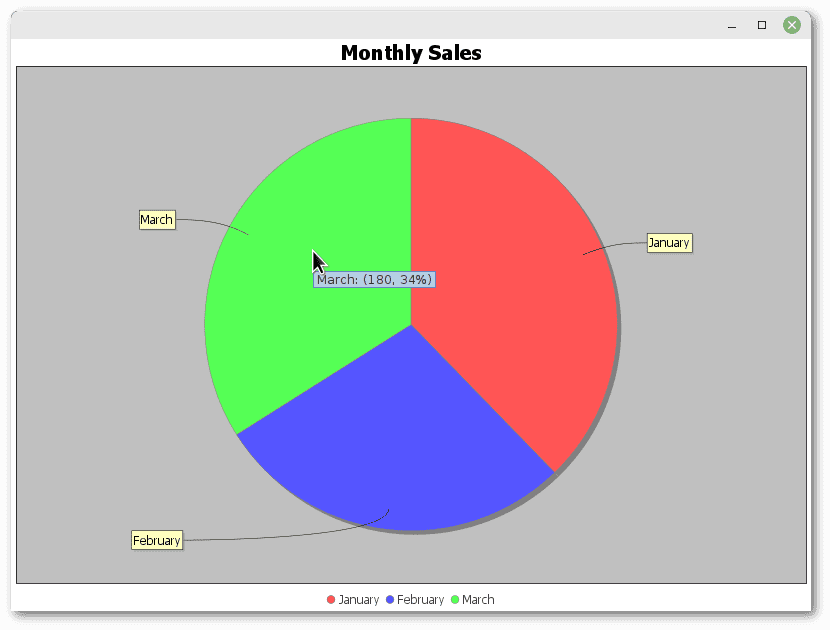
Finally, we should note that there are several variations of the ChartFactory.createPieChart() method for finer customization.
3.3. Time Series Charts
Time series charts show trends in data over time. To construct the dataset, we need a TimeSeriesCollection object, which is a collection of TimeSeries objects, each of which is a sequence of data items containing a value related to a specific time period:
TimeSeries series = new TimeSeries("Monthly Sales");
series.add(new Month(1, 2024), 200);
series.add(new Month(2, 2024), 150);
series.add(new Month(3, 2024), 180);

TimeSeriesCollection dataset = new TimeSeriesCollection();
dataset.addSeries(series);

JFreeChart chart = ChartFactory.createTimeSeriesChart(
    "Monthly Sales",
    "Date",
    "Sales",
    dataset,
    true,    // legend
    false,   // tooltips
    false);  // no URLs
Let’s see the result:
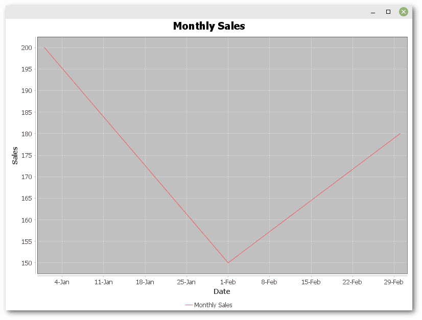
This example shows the power of JFreeChart in plotting time series data, making it easy to track changes over time.
3.4. Combination Charts
Combination charts allow us to combine different types of charts into one. Compared to the previous examples, the code is a bit more complex.
We need to use DefaultCategoryDataset to store the data, but here, we create two instances, one for each chart type:
DefaultCategoryDataset lineDataset = new DefaultCategoryDataset();
lineDataset.addValue(200, "Sales", "January");
lineDataset.addValue(150, "Sales", "February");
lineDataset.addValue(180, "Sales", "March");

DefaultCategoryDataset barDataset = new DefaultCategoryDataset();
barDataset.addValue(400, "Profit", "January");
barDataset.addValue(300, "Profit", "February");
barDataset.addValue(250, "Profit", "March");
CategoryPlot creates the plot area that contains both types of charts. It allows us to assign datasets to renderers — LineAndShapeRenderer for lines, and BarRenderer for bars:
CategoryPlot plot = new CategoryPlot();
plot.setDataset(0, lineDataset);
plot.setRenderer(0, new LineAndShapeRenderer());

plot.setDataset(1, barDataset);
plot.setRenderer(1, new BarRenderer());

plot.setDomainAxis(new CategoryAxis("Month"));
plot.setRangeAxis(new NumberAxis("Value"));

plot.setOrientation(PlotOrientation.VERTICAL);
plot.setRangeGridlinesVisible(true);
plot.setDomainGridlinesVisible(true);
Finally, let’s use JFreeChart to create the final chart:
JFreeChart chart = new JFreeChart(
    "Monthly Sales and Profit",
    null,  // null means to use default font
    plot,  // combination chart as CategoryPlot
    true); // legend
This setup allows for a combined presentation of data that visually demonstrates the synergy between sales and profit:
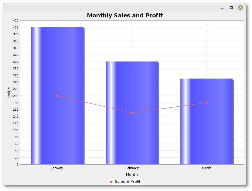
This way, JFreeChart can present complex datasets that require multiple chart types for better understanding and analysis.
4. Conclusion
In this article, we’ve explored the creation of different types of charts with JFreeChart, including line charts, bar charts, pie charts, time series charts, and combination charts.
This introduction only scratches the surface of what JFreeChart can do.