

Yes, we're now running our only Summer Sale. All Courses are 30% off until 20th July, 2026:
Learn through the super-clean Baeldung Pro experience:
>> Membership and Baeldung Pro.
No ads, dark-mode and 6 months free of IntelliJ Idea Ultimate to start with.
1. Introduction
In this tutorial, we’ll discuss presenting research results in a scientific paper.
Writing a paper comes after choosing the research problem, compiling a thorough literature review, and conducting the simulations.
2. Results
Let’s start with an example. Let’s say we conducted an experiment analyzing the performance of a new heuristic algorithm for solving constraint-satisfaction problems. We evaluated it on 50 representative problem instances and compared its speed to an exact solver’s.
One way to present the results is to write a textual summary:
The average solving time of our heuristic method was 12.5 seconds (with a standard deviation of 5 seconds), as compared to 35 seconds as the average solving time of the standard exact solver, whose standard deviation was 4.5 seconds.
Now, is it easier to follow the text or look at an image?
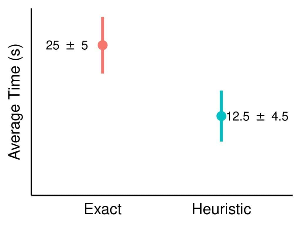
The image conveys the same message as the text but has one crucial advantage: the relationship between the means is immediately visible. In contrast, readers need to visualize textual information in their minds to see how much 12.5 is lower than 35.
2.1. IMRAD
Most scientific papers follow the IMRAD structure, which specifies the order and purpose of mandatory sections of a research article:
- Introduction
- Methods
- Results
- Discussion
The role of the results section is to lay out experimental data and findings separate from our interpretation and inferences, which are reserved for the discussion. The reason for the separation of the presentation and interpretation is twofold:
- it should allow readers to reach conclusions on their own and scrutinize our conclusions uninfluenced by our argumentation
- it should make us more objective in showing and interpreting our findings
2.2. Presentation Principles
So, there are two principles to follow when presenting results:
- fairness – we should show the data without pushing readers to interpret them one way or another
- clarity – the results should be presented in a way that will allow the readers to understand them as quickly as possible
Generally, we can present data textually, as tables, or visualize them. These three approaches are complementary.
3. Text
While it might be tempting to show results only as tables and plots, we shouldn’t dismiss and underestimate the power of words. Although charts are usually more efficient in conveying information, and tables can organize numbers better, words and sentences are still necessary to glue them together.
The presentation of results should be a story: something must give a sense of connection to all the tables and charts and place them in the broader context of our experiment. Without words, we get a sequence of tables and figures that are hard to navigate.
Also, some data are best presented textually. This is especially true for the results of statistical analysis. For instance:
The difference in means of our heuristic algorithm’s solving time and that of the standard exact solver was found to be sgnificant at the 0.05 significance level (p-value<0.01).
While this sentence should be accompanied by a bar chart showing the means, adding the p-value and the t-statistic to the plot wouldn’t be natural.
There aren’t universally agreed-upon rules about writing. The best practice is to follow the guidelines of the scientific journal to which we want to submit our paper. Still, there are some general rules of thumb.
3.1. Active vs. Passive Voice
The active voice is preferred. The reason is that it’s easier and faster to read. For example:
- We used the t-test to check for statistical significance
- The t-test was used to check for statistical significance
The first sentence is more direct.
Additionally, the passive voice may sound bureaucratic and monotone.
3.2. Past Tense
Since we present the results of an already-done study, we should use past tenses.
There’s no point in writing in a future tense to present what we did in our experiment.
3.3. First-Person Narrative
Related to the avoidance of the passive voice is using the plural first-person pronouns (even if there’s a single author). This is a trend in many fields.
Historically, the passive voice was the way to go, but researchers started using the plural first-person narrative to improve the flow since it’s easier to read. For example, instead of:
The control group was selected randomly, and the protocol was followed.
we usually stress that it’s we who did the research:
We selected the control group randomly and followed the protocol.
3.4. Formal Writing Style and Grammar
We should adopt a formal writing style. That means no slang and following the standard. Also, we should ensure our text has no grammar errors or typos.
Of course, it probably never happened that a research paper was rejected because of a single typo or an informal or ungrammatical expression. However, if our article is crawled with such errors, no one will be interested in reading it until the end.
This is true not just for presenting results but also for the entire paper.
3.5. Conciseness
Another rule is to be concise and on point. Words and sentences that don’t add information should be removed. Any phrase that can be simplified – should be simplified. For example, let’s check a paragraph one might write about their experiment:
After many troubles with setting up the equipment, we finally managed to conduct the first experiment. We found that factor X allows us to influence yield Y and that it had a linear effect.
However, is the information that we had many troubles with the equipment relevant to readers? No, it isn’t, so there’s no need to talk about it. Similarly, the second sentence has many unnecessary words. It’s much better to simplify the entire paragraph to:
We found a linear effect of X on Y in our first experiment.
3.6. Informative Words
We should use more specific instead of generic words. For instance, if we notice that increasing parameter A decreases the overall running time of our algorithm from 20 to 10 seconds, we should use precisely the word “decrease”. Let’s compare two sentences:
- Increasing parameter A from 5 to 11 decreased the running time from 20 to 10 seconds.
- Increasing parameter A from 5 to 11 changed the running time from 20 to 10 seconds.
The second sentence uses the verb “change” instead of a more specific “decrease”. That’s why readers need to put extra effort into figuring out the actual effect of A.
3.7. Describing Results and Not Impressions
Finally, we shouldn’t slip into being too descriptive or poetic. For instance, we shouldn’t say an increase is terrible, appalling, or fascinating.
Those words show our impression of the results, not the results.
3.8. Presentation Without Interpretation
The IMRAD model splits the presentation of results from their interpretations. So, we shouldn’t offer explanations or formulate conclusions while presenting the data.
For example:
Increasing parameter A from 5 to 11 decreased the running time from 20 to 10 seconds, which means that this parameter has the main role in optimizing our algorithm’s performance.
While the conclusion might be correct, another explanation could be that parameter A’s effect is confounded with that of other parameters. That and other options should be discussed, but not during the presentation of the results. The goal is to lay out the data as experimental evidence to a research jury: the verdict (conclusion) will come after careful deliberation (discussion).
However, not all researchers follow this approach. Some combine the discussion and results sections and interpret the results as they present them.
4. Tables
Tables are the best option when we have a lot of numbers that can be organized uniformly. For instance, temperature records, various software tools’ execution times, or the concentration of a chemical measured hourly.
In a way, a table is like a database. It contains the experimental data readers should be able to access together, which would take too much space if we listed them in the main text. Instead, we leave it to readers to look them up if they want to and mention only the most relevant results in the textual part.
As mentioned before, journals usually have specific guidelines on table formatting. In general, it’s a good practice to follow some standard rules:
- too many horizontal and vertical lines decrease the clarity
- cells in the same column/row should have the same alignment
- we should use the same number of digits for all numeric values
- the most interesting results should be emphasized (using an italic or bold font)
- footnotes should be short and placed right below the table
- exceptionally long tables should be in an appendix, not the main text
For example:

The table on the right, which follows the above recommendations, looks clearer and more professional than the one on the left.
Finally, we should avoid vertical tables. Readers may not always have a way to rotate the table on their screen and won’t bother if they need to do it often. So, if a table is too long and wide, we should split it into smaller ones or defer it to appendices.
5. Figures
Generally speaking, plots show the same data as the corresponding tables. However, they point out trends, similarities, and differences.
For example, a table can present the execution times of our software for various choices of some parameter A. However, just looking at the numbers in the table won’t show us if there are any patterns. A line plot reveals trends (or the lack thereof) much more effectively.
Here are some general recommendations.
5.1. Clarity
Figures should be clear, with all elements visible without the need to zoom in or rotate.
This means that line widths, marker sizes, and fonts should be large enough to make everything detectable and distinguishable.
The background should have a neutral color, with white being the first choice for many authors.
That being said, we should pay special attention to colors. The thing is that it’s easy to go over the top and use too many colors and shades that will make our plots unclear.
5.2. Simplicity, Minimal Sufficiency, and Relevance
Figures should be as simple as possible and use as few visual elements as possible to show the intended data.
Therefore, all visual elements should have meaning: different colors, shapes, and line types should refer to different things. For example, we can use different colors to represent different algorithms in a comparison graph:
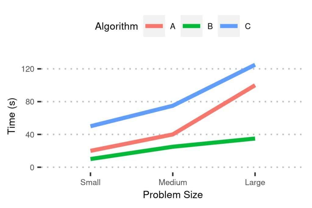
The converse holds as well: everything related to the result should be mapped to the corresponding visual element.
5.3. Using Friendly Palettes
Furthermore, if the journal is printed in black and white, our plots may become unreadable when printed:
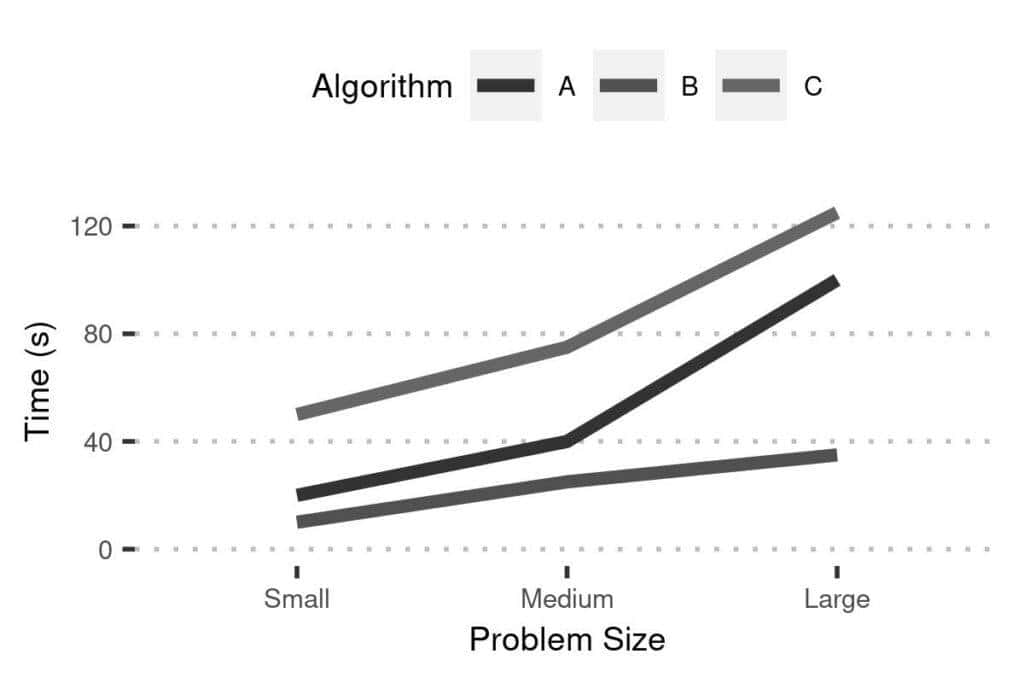
So, we shouldn’t rely only on choosing different colors to point out differences. Instead, we should use printer-friendly palettes to ensure that our plots will be readable even when printed in black and white.
We should also use palettes that are friendly to color-blind people to make it easier for them to understand our charts. For instance, we should avoid using green and red together, as well as other problematic color combinations.
5.4. Combining Visual Elements
Because of that, the best way to go is to combine colors with fill patterns, line types, and other visual elements. For example, it’s easier to differentiate between algorithms if each is identified by the color and the line type than only by its color:
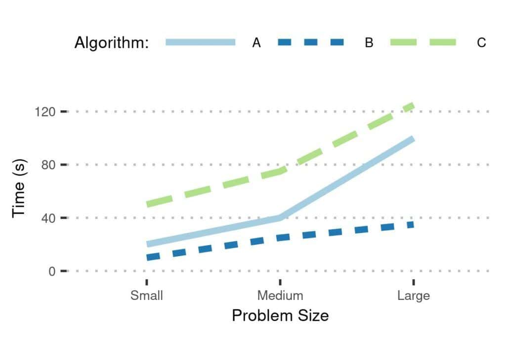
Even if the plot was printed in black and white, it would be clear which line corresponds to which algorithm.
5.5. Choosing the Right Plot Type
Exploring various plot types is out of this article’s scope, so we won’t go into details about how to choose the plot type. However, we point out that this step should be carefully considered.
For example, let’s say that we surveyed a sample of voters about three candidates. Each participant in the study could vote for one of the proposed candidates. Usually, we present such proportions with pie charts, so we can do the same here:
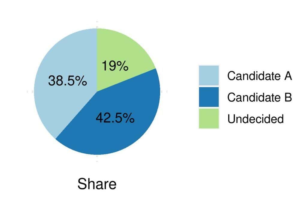
However, it isn’t visually clear which candidate leads and by how much. The differences between them will be spotted easier if we use a bar plot:
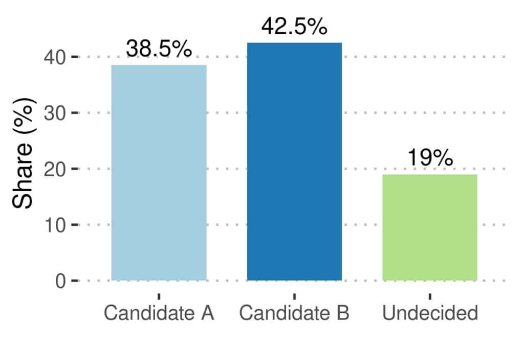
The reason is that humans intuitively and immediately understand and compare heights and lengths, whereas we can’t do that for areas.
5.6. Fair Baselines
Baselines should be fair. For instance, when comparing the three candidates above, we can use the worse result as our baseline:
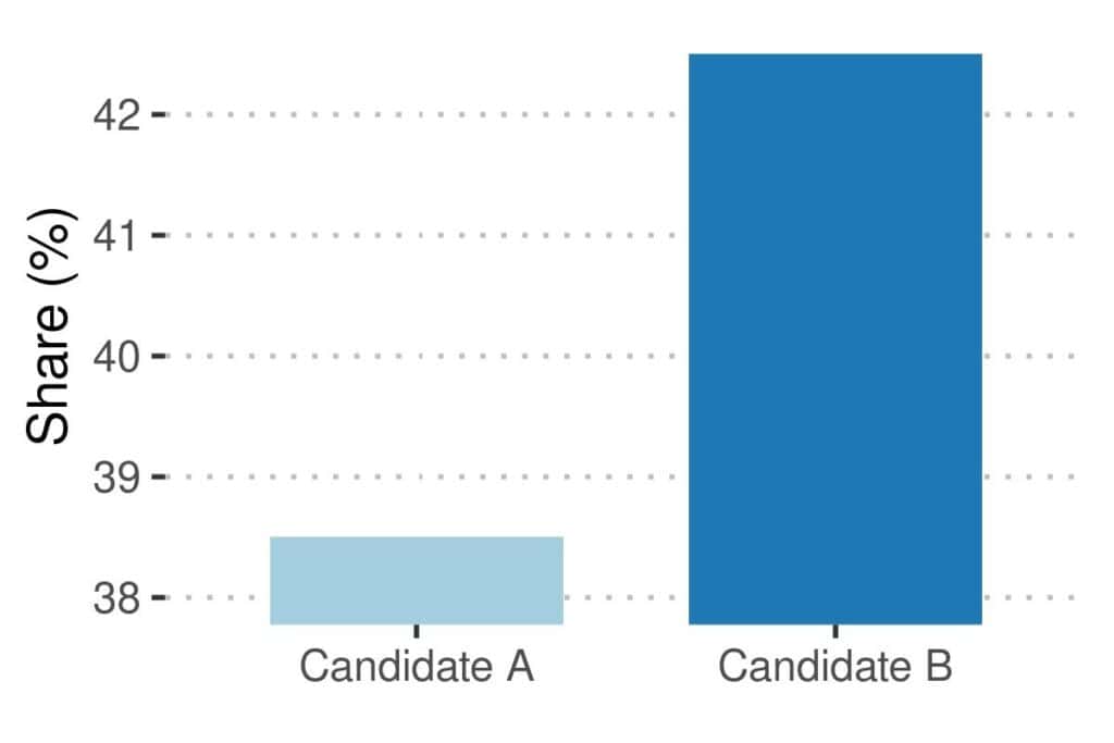
However, that shows that the differences as way larger than they actually are. The plot can lead us to a completely wrong conclusion if we don’t use a fair baseline.
5.7. Informative Captions
Finally, captions should be informative and describe the figure’s content accurately and concisely.
Some journals ask for a short explanation to be included in the caption. For instance, instead of naming our figure “Comparison of QuckSort and MergeSort“, we could add a short description:
Comparison of QuickSort and MergeSort: QuckSort was consistently faster than MergeSort on our benchmark set.
The rationale behind this is that readers are likely to read captions and short summaries when skimming through an article and deciding if it’s worth investing time into reading it thoroughly.
6. Conclusion
In this article, we talked about presenting research results in a paper.
There are three main ways of presenting results: textually, tabularly, and visually. They are complementary and should follow the principles of fairness and clarity:
- fairness means the results should be presented objectively and as they are
- clarity means that the results should always be presented in the simplest possible way